Monday, June 13, 2011
Sunday, June 12, 2011
PDF Pages
Here are the pdf pages I just sent to Ryan. I still have one more page for Environments. I am going to try to re-paint one of the isometrics for my environments, so that may change.
Anna's Iso


So here's where I'm at with the iso. I'll obviously clean it up, but I'd like your guys' thoughts on it. I'm considering elongating the trunk slightly and moving the trees on the right a bit to avoid "accidental turtle."
Aside from that I'm finishing the tonal paint of my prop, coloring the environment perspective a bit, and touching up anything left on the character.
I have a final 2:45-4:45, And this one starts at 5, right?
Saturday, June 11, 2011
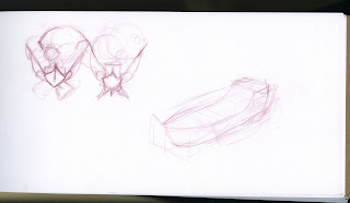
Norm Boats
Isometrics paint
Tried o go in and paint some of those isometrics and... I dunno. I really wanted a festive look but if I pu anything more saturated on them they turn out horrible. I am struggling with these!
Any thoughts?
Any thoughts?
Friday, June 10, 2011
The Work Train Missed a Stop
Hey guys. Sorry I missed class- I was painting and then I looked up and it was 8pm!!
Here's what I've been doing:
Here's what I've been doing:
Thursday, June 9, 2011
Monday, June 6, 2011
font/layout stuffs
Here are three font tests to see what would work the best. Example01 is what the group picked, but I still don't feel it's a very strong font, and is a little difficult to read. Yes it sort of fits our style, but strong a presentation is more important. IN drawing bad drawing is bad drawing, style can't make it better; the same goes for font. If I didn't care about this, I wouldn't bother and I figured with 3 examples we could see what works best. In my opinion either example02 or 03 would be better choices. They're much easier to read, I think this is important because there are some strange words, Yvaine is a perfect example, and it's almost un readable in example01. I know we went over it in the group, but fonts look different typed out, and we hadn't seen it in the layout. I'm looking at this from a design point of view, I'm not trying to be selfish or prove anyone wrong, I'm just going off of good design. Any-who, those are my thoughts, I also went with a dark dull blue for font color instead of black. It's subtle, but I think it works better.
Example01

Example02
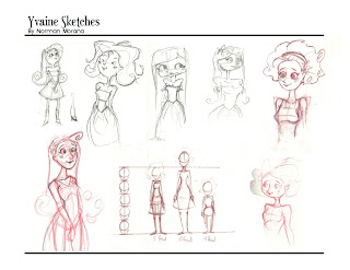
Example03
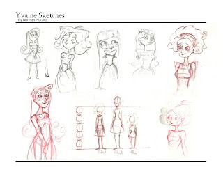
Example01

Example02

Example03

Sunday, May 29, 2011
Healer Tent Paints (WIP)
Hey guys, I'm trying to paint the isometric of this tent and it's proving to be super hard. I have a really hard time with color and tone, and it just keeps getting muddier. here's where it's at so far, any advice will be welcome!
Thursday, May 26, 2011
Frustration
Hey guys. I didn't have a ton of time to draw this week- I've been apartment shopping. I know that's not excuse. Anyways, I've been drawing all morning and having very little luck so far. This is what I have right now.
Some shape variations from a fw days ago, looking for was the break the silhouette and expand on the initial idea:
A kind of breakdown of Sal's caravan:
I'm giving the above a complete redo because it's too small AND the wrong shape (too round!). Here's the original for a quick comparison:
But The details are pretty close to what I want.
See you guys tonight!!
Saturday, May 21, 2011
PDF PARTY TIME
Hey guys, we have to meet up to design and set up a PDF of our project so far! Everyone post your availability in the comments and we'll work it out!
Friday, May 20, 2011
Norman Yvaine painting update
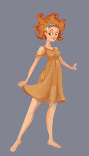
So I finally started to work on her again. for this I just fixed the hair based on our critique a few weeks back. What do you guys think? I did the hair, and I started going over the edges in some texture.

Thursday, May 19, 2011
Wall Iso Value Study
Wednesday, May 18, 2011
Props And Vehicles by Laura
Here are some thumbnails. I think I'm going to focus on Sal's caravan. I had two more pages of thumbs but I seem to have lost them in transit. More to be done tonight/tomorrow.
Tuesday, May 17, 2011
Iso Town of Wall
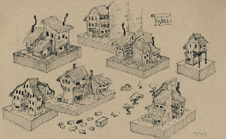
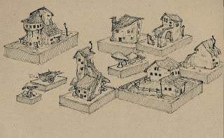
Here are two isometric pages of Wall. I will cut and paste them and/or shuffle them around to make a more interesting village setting. Then, look at where I could figuratively stand to draw a POV shot for the concept design. ...Maybe I just leave it as an iso shot instead. We'll see. I will post a few comps of the village when it's put together.
Sunday, May 15, 2011
Proprs/Vehicles
Hi guys. It came to my attention just now that we didn't make a comprehensive list of props/vehicles to work on for next week. For those of us who haven't read the book, here's a qick list off the top of my head with any descriptions:
Vehicles:
~Air ship: Flies in the air, catches lightling with rods in a big metal tank.
~Sal's caravan: She sells flowers out of it and it is her home.
~The Witch Queen's Carriage: Pulled by two goats.
Props:
~Stormhold Kingdom necklace: Has a big stone set in it, is the key to Stormhold.
~Tristran's sack: His stuff is in here.
~Glass flower: Stunningly beautiful flower made of glass.
~Silver chain: Magic chain that binds Yvaine to Tristran, glitters like silk and moonlight, stronger than steel.
~Witch Queen's Knives: Made of black glass or stone, wickedly sharp, one is big and serrated, one is small and scalpel-like
~Lanterns, Bridles/bits/saddles, quilts and rugs, mugs, travel gear, etc : Everyone needs lanterns and stuff like that
Hopefully that helps anyone who was feeling lost! I'm guessing we'll have thumbnails and rough sketches this week, and finish with orthographics and finished sketches the following week?
Monday, May 9, 2011
Wall Environment
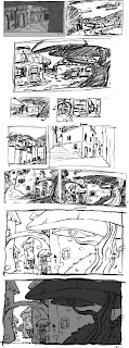 Alright. Here is an updated version of Wall. You can see from the top left, the thought process I went through to get down to a cleaned up version with very rough values thrown in on the bottom. Let me know what you guys think. Better? I hope.
Subscribe to:
Comments (Atom)


