Monday, June 13, 2011
Sunday, June 12, 2011
PDF Pages
Here are the pdf pages I just sent to Ryan. I still have one more page for Environments. I am going to try to re-paint one of the isometrics for my environments, so that may change.
Anna's Iso


So here's where I'm at with the iso. I'll obviously clean it up, but I'd like your guys' thoughts on it. I'm considering elongating the trunk slightly and moving the trees on the right a bit to avoid "accidental turtle."
Aside from that I'm finishing the tonal paint of my prop, coloring the environment perspective a bit, and touching up anything left on the character.
I have a final 2:45-4:45, And this one starts at 5, right?
Saturday, June 11, 2011
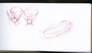
Norm Boats
Isometrics paint
Tried o go in and paint some of those isometrics and... I dunno. I really wanted a festive look but if I pu anything more saturated on them they turn out horrible. I am struggling with these!
Any thoughts?
Any thoughts?
Friday, June 10, 2011
The Work Train Missed a Stop
Hey guys. Sorry I missed class- I was painting and then I looked up and it was 8pm!!
Here's what I've been doing:
Here's what I've been doing:
Thursday, June 9, 2011
Monday, June 6, 2011
font/layout stuffs
Here are three font tests to see what would work the best. Example01 is what the group picked, but I still don't feel it's a very strong font, and is a little difficult to read. Yes it sort of fits our style, but strong a presentation is more important. IN drawing bad drawing is bad drawing, style can't make it better; the same goes for font. If I didn't care about this, I wouldn't bother and I figured with 3 examples we could see what works best. In my opinion either example02 or 03 would be better choices. They're much easier to read, I think this is important because there are some strange words, Yvaine is a perfect example, and it's almost un readable in example01. I know we went over it in the group, but fonts look different typed out, and we hadn't seen it in the layout. I'm looking at this from a design point of view, I'm not trying to be selfish or prove anyone wrong, I'm just going off of good design. Any-who, those are my thoughts, I also went with a dark dull blue for font color instead of black. It's subtle, but I think it works better.
Example01

Example02
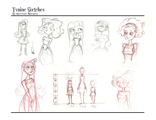
Example03
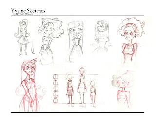
Example01

Example02

Example03

Subscribe to:
Comments (Atom)


