Saturday, June 11, 2011

Isometrics paint

Tried o go in and paint some of those isometrics and... I dunno. I really wanted a festive look but if I pu anything more saturated on them they turn out horrible. I am struggling with these!

Any thoughts?


Friday, June 10, 2011

The Work Train Missed a Stop

Hey guys. Sorry I missed class- I was painting and then I looked up and it was 8pm!!

Here's what I've been doing:


Monday, June 6, 2011

font/layout stuffs

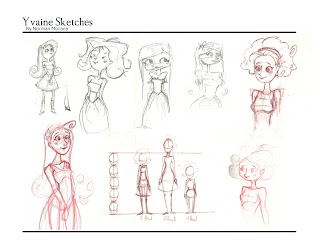
Here are three font tests to see what would work the best. Example01 is what the group picked, but I still don't feel it's a very strong font, and is a little difficult to read. Yes it sort of fits our style, but strong a presentation is more important. IN drawing bad drawing is bad drawing, style can't make it better; the same goes for font. If I didn't care about this, I wouldn't bother and I figured with 3 examples we could see what works best. In my opinion either example02 or 03 would be better choices. They're much easier to read, I think this is important because there are some strange words, Yvaine is a perfect example, and it's almost un readable in example01. I know we went over it in the group, but fonts look different typed out, and we hadn't seen it in the layout. I'm looking at this from a design point of view, I'm not trying to be selfish or prove anyone wrong, I'm just going off of good design. Any-who, those are my thoughts, I also went with a dark dull blue for font color instead of black. It's subtle, but I think it works better.

Example01

Example02
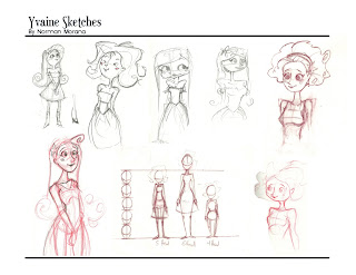
Example03
Sunday, May 29, 2011

Healer Tent Paints (WIP)

Hey guys, I'm trying to paint the isometric of this tent and it's proving to be super hard. I have a really hard time with color and tone, and it just keeps getting muddier. here's where it's at so far, any advice will be welcome!

Thursday, May 26, 2011

Frustration

Hey guys. I didn't have a ton of time to draw this week- I've been apartment shopping. I know that's not excuse. Anyways, I've been drawing all morning and having very little luck so far. This is what I have right now.

Some shape variations from a fw days ago, looking for was the break the silhouette and expand on the initial idea:


A kind of breakdown of Sal's caravan:


I'm giving the above a complete redo because it's too small AND the wrong shape (too round!). Here's the original for a quick comparison:


 But The details are pretty close to what I want.

See you guys tonight!!

Saturday, May 21, 2011

PDF PARTY TIME

Hey guys, we have to meet up to design and set up a PDF of our project so far! Everyone post your availability in the comments and we'll work it out!