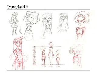
Here are three font tests to see what would work the best. Example01 is what the group picked, but I still don't feel it's a very strong font, and is a little difficult to read. Yes it sort of fits our style, but strong a presentation is more important. IN drawing bad drawing is bad drawing, style can't make it better; the same goes for font. If I didn't care about this, I wouldn't bother and I figured with 3 examples we could see what works best. In my opinion either example02 or 03 would be better choices. They're much easier to read, I think this is important because there are some strange words, Yvaine is a perfect example, and it's almost un readable in example01. I know we went over it in the group, but fonts look different typed out, and we hadn't seen it in the layout. I'm looking at this from a design point of view, I'm not trying to be selfish or prove anyone wrong, I'm just going off of good design. Any-who, those are my thoughts, I also went with a dark dull blue for font color instead of black. It's subtle, but I think it works better.
Example01

Example02
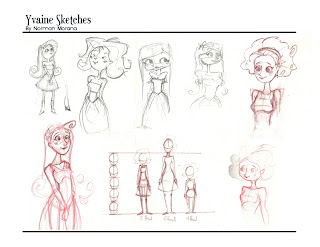
Example03